 The purpose of this article is not to tell you how to design your Philips ProntoPro or aid in coming up with an original layout, but rather to assist you in obtaining the best possible quality graphics, regardless of your artistic abilities. There's no reason why your remote shouldn't look the best it can! Most graphic artists or web developers will already know many of these tricks, but for anyone new to bitmap editing or who has not yet designed for a graphical remote control, there are some important techniques that you may not be aware of.
The graphics used in my CCF file were all originally created as vector artwork in CorelDRAW 10, then converted to ProntoProEdit-ready bitmaps via CorelPHOTO-PAINT 10. Although my experiences are with these programs, almost any vector and bitmap editing software will have similar capabilities - and limitations.
1. Choose colors that work.
Naturally, the ProntoPro isn't as graphically capable as your desktop PC. This is a given with the obviously limited black & white Pronto, but may need clarification on the color ProntoPro: the word "color" doesn't actually imply a PC-quality interface. First, most computer desktops are set to run in 64,000 or 16.7 million colors, which results in photo-realistic images. The ProntoPro is capable of displaying 256 colors - a far cry from millions or tens of thousands of colors. 256 colors may still sound like a lot, until you work out exactly how many shades of red, yellow, blue, orange, green, purple, black, etc are possible.
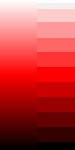  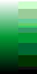 
Thus, when designing, it's always a good idea to first test out how your graphics will look when converted to a limited color set. The color bars above demonstrate this issue. On the left side of each bar is a 24-bit 16.7 million color graduation, as your computer would normally display, while the right half is an 8-bit 256 color image as the ProntoPro would display. You can see how much rougher the bars on the right are. What this amounts to is a limitation to how much fine detail the remote can faithfully reproduce. For instance, green might not be the best color choice if your design involves a lot of small, detailed buttons, since the end result would be fairly crude. Finally, never start off working in 8-bit color - for best results always use 24-bit color and convert down to 8-bit later.
Another consideration in color choice involves what the ProntoPro's screen can actually show. The "passive matrix" LCD does not reproduce colors exactly like your computer. What looks great in ProntoProEdit may not look quite as good on the actual remote. Remember that colors on the remote will be more washed out. Dark colors will tend to fade out to black, while very light colors will disappear into white. For best results, always use strongly contrasting colors to differentiate your buttons from the background and the text label from your button. Avoid using similarly toned colors - for instance don't place medium red buttons on a medium blue background.
|