On September 26, 2012 at 23:53, iimig said...
Got a rendering from our graphic designer for the new vans
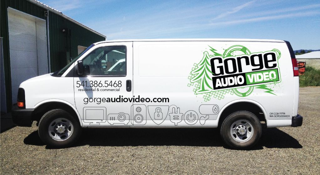
Looks good. The only thing that jumps out at me is the icons being different sizes. The text stacked above them gives it a "bumpy" jumbled look. I would try creating a square with rounded edges box for each icon so they are symmetrical (like app icons). This will smooth things out visually.

If you don't like the "app icon" look i would try and get the icons to be closer to the same size or play with arrangement.
Another option would be to go bigger with the icons so that their tops are just under the door handle. Make their lines lighter and then have the gorge domain right down the middle of them. So basically the icons are the background for the text. See the logo at this site
[Link: reillywd.com] . These guys have vans with huge versions of that logo. You can see the logo but the text is obvious too.