 
Designed for:
Philips ProntoPro NG TSU7000
Submitted by:
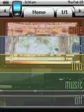
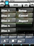
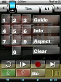
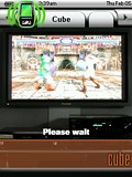
| Contest Entry #03: Simple Theater My approach to developing the user interface for my ProntoPro NG was focused on practicality and function. The PPNG's utility, in my opinion, comes from its many hard buttons--allowing a user to issue commands without looking down at the remote. My design therefore tries to use the hard buttons for the most common operations: arrow navigation, chapter advance, home page, the "TiVo" button, and so on.I believe the most practical user interface for an entertainment system is one that focuses on activities rather than devices. The design I've implemented hides the devices that are merely providing "output" (namely the receiver and the television). The activities are roughly analogous to "input" devices (DVD player, DirecTivo, GameCube, and music). However, the user interfaces for these activities are often sparse--limited to only those remote control features I have ever utilized while engaged in an activity. If I'm playing GameCube, I only care about controlling inputs, adjusting the volume, and switching the television aspect. Where possible, I have tried to keep buttons that provide a given function across multiple activities in roughly the same place. For example, a "Go" button that enables an activity even if the remote's UI is already set to that activity is always located at the bottom-right. Keeping the interface limited to buttons that I actually use allows me to avoid paging and the device overview pages. Therefore these two screens retain their factory look and feel. The graphic design is intended to mimic the section color-coding style that is so typical on web sites. Each background is a photo of my entertainment system fired up to the activity in question. The home page is a composite of slices from these photos. | 
