|
...Continued from Page 2.
4. Converting to the right colors.
As explained in the first tip, the ProntoPro is capable of displaying 256 colors (8-bit). However, those colors can't be any 256 of your choosing: you must work with the remote's preset palette. Although specifications claim that the remote uses a 215-color "web safe" palette, this isn't completely accurate. The first 215 colors of the ProntoPro's palette are indeed made up of 215 "web safe" colors, however there are an additional 41 colors specified, mostly pinks, blues and grays. So, since this doesn't match up with any default palette, this presents an issue: exactly how to use all of those hidden colors.
If you merely convert an image to the 215-color "web safe" palette, you'll be losing out on a lot - particularly grayshades. Some users have found that the default "Windows system" palette that many programs include uses the "web safe" palette and adds an additional number of grayshades, however this still doesn't make use of everything that the remote is capable of. To find out what colors are valid, load up the default configuration in ProntoProEdit and start the ProntoProEmulator. Take a screen capture by pressing "Print Screen", then start up your favorite bitmap editing program and load the capture. Most programs will allow you to take the color palette stored in that file and save it to disk for use later in converting 24-bit "true-color" images.
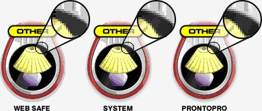
Take a look at the three examples above. The one on the left was converted to the "web safe" palette. The graphic in the center uses the "system" palette, while the one on the right uses the true "ProntoPro" palette. The enlarged sections show the difference additional grayshades can make. One of the reasons my layout uses a lot of blues and grays is because that's what the ProntoPro's color palette leans towards. Note that most of these "additional" colors are not mentioned anywhere in ProntoProEdit and can be discovered only by the method above.
5. Dithering is a must!
Something that goes hand-in-hand with using the right color palette is a technique called "dithering". Dithering is a method of alternating a limited number of colors to emulate an even greater number. Remember those strong, stepped colors in the first tip? These can be "smoothed out", as it were, by using dithering. Although quite a few automated dithering techniques have been created over the years, I can only suggest using one of the randomized versions (often called "error diffusion") to convert your image from 24-bit to 8-bit. Don't use the "ordered" variation, as this creates visible patterns that don't look very good.
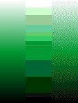
Observe the differences between the examples above. The two images on the left side of the screen both use the ProntoPro's color palette and anti-aliasing. The image to the far left uses no dithering, while the image in the middle employs diffused dithering. The green bar to the right demonstrates the difference between 24-bit true color, ProntoPro normal and ProntoPro dithered. Although ProntoProEdit is capable of doing some image conversion itself, it does a very poor job of color selection and dithering. You are always better off doing this beforehand, even for the black and white Pronto.
6. Manual tweaking.
Even if you employ all of these techniques, there's often still a need for manual editing. Some dithered pixels may be in places you don't want them; a small bit of text might not be quite readable enough; you may find that part of an image looks good with dithering while the rest does not. A little bit of hand-editing can go a long way towards a perfect CCF.
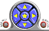
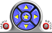
Below you can see two examples. One uses all of the suggestions made above, while the other uses none. Quite the difference!
I hope that you'll find some of these suggestions useful for creating the best looking bitmaps possible.
|