|
|
 |
|

The following page was printed from RemoteCentral.com:
| Topic: | What happened to the talented touch panel graphics? This thread has 81 replies. Displaying posts 16 through 30. |
|
| Post 16 made on Monday July 5, 2010 at 13:49 |
Fiasco Senior Member |
Joined:
Posts: | July 2009
1,276 |
|
|
What may be right and perfect for one may very well suck for another.
|
Pump House on Facebook: [Link: facebook.com] |
|
| Post 17 made on Monday July 5, 2010 at 16:58 |
gwstudios Senior Member |
Joined:
Posts: | June 2004
1,376 |
|
|
That sums up my response in one sentence.... thanks Fiasco. By the way, I see you have been consumed with CF as much as I have. I like some of the things you have done with the swipe menus and layouts.
|
|
|
| Post 18 made on Monday July 5, 2010 at 17:51 |
Fiasco Senior Member |
Joined:
Posts: | July 2009
1,276 |
|
|
CF is just a few features short of being the end all, be all (IMHO). You give me too much credit as a "GUI Designer". I'm relatively new to the industry and just stumbling through doing the best I have and trying to develop my meager talents into a marketable commodity. I find stamps "SWAT" theme very appealing. I like the monochromatic look, symmetry. SWAT's elegance is it's simplicity. IMHO, once a GUI template becomes more and more "stylized" (or personalized) you are effectively increasing the "ooh ahh" factor for a percentage of the potential market, another percentage will like it less and the rest will be indifferent. More people like Vanilla ice cream than Rocky Road.
Last edited by Fiasco on July 5, 2010 18:35.
|
Pump House on Facebook: [Link: facebook.com] |
|
| OP | Post 19 made on Monday July 5, 2010 at 23:45 |
Audible Solutions Super Member |
Joined:
Posts: | March 2004
3,246 |
|
|
I was a salaried programmer new to the job when I was asked to imitate what their previous CAIP had come up with. He has a dashboard, a run time selectable groups page and a page that allowed you to adjust the volume for each room. Kicking and screaming I developed a GUI that did all of this and more from the audio selection page. I had nothing but contempt for it till clients began using it. Suddenly, my contempt turned into fascination as they loved the GUI, even if they could not explain their preference. One of my favorite memories was the salesman on a job insisting on drop down menu GUI. Having perfected that we put in my audio GUI just for party or group control. First time he touched it the client said it blew away his drop down menu GUI and asked why we were using the drop down menus.
A few of you continue to miss the point as you point to gestures, top and bottom menus ( unless you can write source code please reconsider the word "activities." ), and take refuge in one man's ceiling being an other's floor. It's about the design and why Crestron's graphic artist gets it right so often and the rest of you do not. It's about the fact that many dealers have gone to Destiny not merely because it's free but because it contains graphical elements missing in your work. It's visually interesting whereas your collective recent designs are not.
The point is not if you like Yellow Jacket, Adagio Nitrate or Crestron's new Ipad design. It's about one individual understanding something the rest of you continue to ignore with the result that your designs suffer. Slap yourselves on the back, link to each others sites. buy yourselves a pint and go to bed knowing your monochromatic designs are state of the art. It's not about how many new graphics or icons you now incorporate into your latest efforts. It's about examining your a priori assumptions.
It's not about my opinion which is how you've chosen to frame your responses. I know I write clearly. Others participating in this thread have understood it so I'll take your decision to misunderstand it as intentional.
Ignore the facts, if you'd like. The fact is you are all collectively missing something and in the end it will cost you sales. I don't want you guys to develop GUIs. You suck at that. I want you to develop graphical templates that are visually interesting. Even the aesthetically unappealing Yellow Jacket is monochromatic. Nitrate is monochromatic. Take away the backgrounds and the monochromatic iPad graphics are still better visually more interesting than your designs. It's the brilliant use of images, shapes, borders and button types. Sure, it also allows the use of "activity" icons which introduces color. I removed the information header from my edition and it still more interesting than your collective efforts.
Change is hard. Habits of thought, C.S. Pierce has taught, pass for knowledge and we are loathe to break out of the comfort of what is known. I'm not suggesting I'm in love with Adagio Nitrate or Yellow Jacket. I am suggesting they incorporate elements into their design that yours are missing and for which they are poorer. You can continue to produce boring designs. You can continue to miss the point by speaking to gestures and "an Apple experience." It's the absence of shape, texture, depth, and the overuse of the same button types and sizes in these designs.
Vote with your feet. But someone with the graphics suite skills is going to read this, look at what Crestron's graphic artist has accomplished and will get it. He will incorporate those elements into his work and assuming he prices them wisely, he will make a lot of money. Because it has zero to do with resolution, panel size, the type of graphics files, backgrounds or gestures.
Alan
|
"This is a Christian Country,Charlie,founded on Christian values...when you can't put a nativiy scene in front fire house at Christmas time in Nacogdoches Township, something's gone terribly wrong" |
|
| Post 20 made on Tuesday July 6, 2010 at 02:52 |
Tom Ciaramitaro Loyal Member |
Joined:
Posts: | May 2002
7,965 |
|
|
On July 4, 2010 at 16:03, 39 Cent Stamp said...
Diet Soda
Light Cigarettes Lowfat chocolate milk Jumbo shrimp
|
There is no truth anymore. Only assertions. The internet world has no interest in truth, only vindication for preconceived assumptions. |
|
| Post 21 made on Tuesday July 6, 2010 at 03:39 |
nerieru Long Time Member |
Joined:
Posts: | January 2009
233 |
|
|
On July 5, 2010 at 12:17, Audible Solutions said...
[Link: crestron.com]Apple_iPad-XMac_Demo_2010 Models Included: CRESTRON-MOBILE-PRO-G, SW-XPANEL-FOR-MAC The vtp file is embedded in the example program. To be clear, it's not a perfect design. It does require customization. But it gets the important points right. And Crestron's graphic artist gets it right more often than anyone else selling templates. Checking it out, thanks. Yellow Jacket blows away GUIFX's cockpit GUI. Adagio Nitrate and Destiny get more right then they do wrong. All require editing and customization, to get them to match one's design goals. That is to be expected. I'm somehow getting a feeling that you're joking around with us here, there are so many things wrong with those designs that I can't even begin to name them 1 by 1, as that wouldn't fit in a single forum post. |I've only seen one other person who worked for a company for whom I once programmed who also got GUI design right ( and I mean touch panel graphical design, not touch panel GUI design. I don't expect a graphic artist to understand GUI flow. ). Whose designs incorporated color, textured boarders, different button shapes and depth and were visually interesting without going over the top. GUI = Graphical User Interface. Generally you have G and UI. You get thought UI design (not graphical!) when you study Software Engineering. You get the G from Graphic studies. A good GUI is [b]not[/b] about how cool it looks, a good GUI is so much more. The GUI is the largest part of the user's experience. A GUI needs to be easy to use and visually appealing. Let me define "easy to use". Easy to use basically means people [b]know[/b] where to go, without having ever used the UI. People know where certain elements are, because the expect them to be there, people know what buttons do because buttons describe the action that they do, people can do actions in the shortest amount of time with as little movement as possible. So why are those Crestron designs bad examples? They're [b]all over[/b] the place, there is no knowing where to go, knowing where to find elements. Though arguably appealing it's not a good UI. In all honesty the stock TPMC-10 GUI and GUI code were among the best examples I've ever seen. It's a lot of work to modify but it is a fabulous example of aesthetic touch panel design and GUI flow. Aesthetically appealing, maybe (not to me), good UI, no. Then again these are rather old designs, so it's not right to judge them for current day standards. I do not think his designs are better because he has inside information. It's not just his use of png graphics. Yellow Jacket, Nitrate, and Destiny use traditional jpg and bmp graphics. He does use curved images, textured borders, and subtle use of color differences. His work deserves imitation. Many have said that Destiny is being used by many dealers. It's not just because it's free. That's a factor. But it's significantly better than any of the designs template designers are offering. The touchpanels we need to work with are generally low-res, low-bit and low-capability touchscreens. My brother and sister are in the design business and they mimic the design goals that can be found in touch panel design. I'm getting the, well my brother and sister are in the business they know how to do stuff, look at them vibe. I could be wrong, but you should really try reading a book (or two) on UI design and on Graphical design. Maybe follow a few courses. In a past life I took a GUIFX design and spent considerable amount of time modifying it to work as a GUI. It's not that all of their designs suck. Their cockpit design ( which probably was NTDESIGNs work ) was less than satisfactory. If you look at the Crestron designs here you will see they are generally superior to the design template community. Strangely enough I show these designs (and AMX's) to my clients and then show my designs, I have never had a single client pick something other than my designs. That is without saying a word and only showing what they can pick. (And of course custom design) I can (with confidence) give a panel I designed to a client. Without explanation they're able to use, navigate and enjoy the system. Though I sometimes have to throw in a "don't worry the panel won't bite you". Which is generally with older folks that are unaware of the 'touch' part in touchpanel. I hope the tone in my post wasn't too much, to be honest you're kinda freaking me out.
|
"All of the books in the world contain no more information than is broadcast as video in a single large American city in a single year. Not all bits have equal value." - Carl Sagan |
|
| Post 22 made on Tuesday July 6, 2010 at 03:48 |
gwstudios Senior Member |
Joined:
Posts: | June 2004
1,376 |
|
|
"I don't want you guys to develop GUIs. You suck at that" "You can continue to produce boring designs" "It's not about my opinion which is how you've chosen to frame your responses. I know I write clearly. Others participating in this thread have understood it so I'll take your decision to misunderstand it as intentional" Alan, Some of your remarks are intentionally brutal to elicit a response and it seems as though you are looking for someone to argue with and drive your point home repeatedly. I would just like you to know that I completely understand your posts and appreciate your input. Thank you very much. Noel Edit - Just for the record, Cockpit was created in house by GuiFX if I am not mistaken and not by Aaron at NTDesigns.
Last edited by gwstudios on July 6, 2010 04:21.
|
|
|
| Post 23 made on Tuesday July 6, 2010 at 09:00 |
ejfiii Select Member |
Joined:
Posts: | July 2003
2,021 |
|
|
Sorry Alan, but you need to wake up.
Crestron current limitations:
1. no rotation between portrait and landscape
2. no gestures or swiping
3. Program has to run on the processor (this means no sales demos of the fancy ipad gui in sales meetings without a processor) as well as the bigger issue of the program having to load over wireless every time it runs on the ipad.
Until Crestron addresses these issues Command Fusion will remain the superior GUI implementation program for Crestron systems.
You can say that we are missing the point or whatever stupid argument you want to make when in fact those issues preclude the crestron program or GUIs from being viable solutions for the Ipad.
|
|
| Post 24 made on Tuesday July 6, 2010 at 09:03 |
39 Cent Stamp Elite Member |
Joined:
Posts: | May 2007
17,518 |
|
|
No more listen to code monkey. 
|
Avid Stamp Collector - I really love 39 Cent Stamps |
|
| Post 25 made on Tuesday July 6, 2010 at 09:50 |
nerieru Long Time Member |
Joined:
Posts: | January 2009
233 |
|
|
On July 6, 2010 at 09:03, 39 Cent Stamp said...
No more listen to code monkey. Fake (and gay, for those who know what I'm talking about). But seriously, he needs to run parallels/vmware/bootcamp to be able to program crestron/amx/whatnot
|
"All of the books in the world contain no more information than is broadcast as video in a single large American city in a single year. Not all bits have equal value." - Carl Sagan |
|
| OP | Post 26 made on Tuesday July 6, 2010 at 19:16 |
Audible Solutions Super Member |
Joined:
Posts: | March 2004
3,246 |
|
|
On July 6, 2010 at 03:48, gwstudios said...
Some of your remarks are intentionally brutal to elicit a response and it seems as though you are looking for someone to argue with and drive your point home repeatedly. I do not wish to be brutal. I do wish to be blunt. I don't expect a graphic artist to be an expert in GUI design. I expect him to be an expert in graphical arts. As with Crestron's work I'll improve on it so that it meets my desired needs. Just make the damned template visually exciting. I would just like you to know that I completely understand your posts and appreciate your input. Thank you very much.
Noel
Edit - Just for the record, Cockpit was created in house by GuiFX if I am not mistaken and not by Aaron at NTDesigns. Then I have succeeded in my goal which is to get a template that is at least as good as what Crestron is producing. Bye the bye, I was looking to purchase a template which is what led to this thread............. "Crestron current limitations: 1. no rotation between portrait and landscape 2. no gestures or swiping 3. Program has to run on the processor (this means no sales demos of the fancy ipad gui in sales meetings without a processor) as well as the bigger issue of the program having to load over wireless every time it runs on the ipad." Sorry EJ but you continue to miss the point of this thread. You like Command Fusion, use them. You dislike the Crestron app, don't use it. This is not about one app vs an other. The strength of one app vs the other has nothing to do with the design of the graphics running on the iPad. I'm sure gestures will be de rigueur but they are also beside the point of this thread. I'm sure "the apple experience" will be de rigueur but it's also beside the point I wish to make. You can have a dull panel that permits gestures, is in Portrait and runs on the iPad. It's still going to be dull graphical design. You wish to debate the failings of the Crestron app and the superiority of Command Fusion's, then start an other thread. This one concerns template design. Or better yet, let Anthony loose to speak his mind given the excellence of his work.
|
"This is a Christian Country,Charlie,founded on Christian values...when you can't put a nativiy scene in front fire house at Christmas time in Nacogdoches Township, something's gone terribly wrong" |
|
| Post 27 made on Tuesday July 6, 2010 at 20:28 |
39 Cent Stamp Elite Member |
Joined:
Posts: | May 2007
17,518 |
|
|
Your mention of yellow jacket and cock pit and nitrate have me thinking your looking for something like these. Hopefully they show up.. im hotlinking from deviant art so they may not display here. 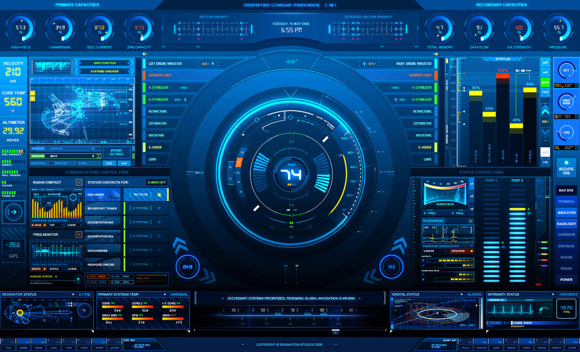     I like this stuff also but after years and years of trying to fit every aspect of a crestron system on to a TPMC-8X.. there just isnt space for it. Even with the additional space and higher resolution on the iPad i wont be moving outside of the 'boring' box. Instead i will use the additional space to eliminate page flips within a given device menu like i did with DirecTV above. GUIFX has a very cool looking template called Lucas. I love the graphics and the colors. The problem IMO is that you cant really do anything with it. I think it would work fine for a small system but once you start adding sources and subsystems and features it gets so busy that it doesnt look beautiful anymore and you totally defeat the purpose of having such a cool looking interface. The job im at has 16 sources so far and they still haven't decided on what media server to use. If they do 4 zones we end up with 20 AV icons. Even on the 15&17 panel there just isnt space to do anything other than a rectangular icon. 2 Major reasons why you dont see this sort of cool/3D design yet. #1. Control system touchpanel displays suck. Crestron recently replaced between 10-15 of their models so its not as bad as it was. The TPMC-8X was ok but you didnt get decent graphics until you moved up to the 15 & 17" panels. Anything before the TPMC-8X didnt support transparent PNG and had fewer colors. Here is some touchpanel info. ST-1550C 8 bit 256 colors ST-1700C - TPS-2000 16 bit 64000 colors TPMC-8X 16 bit 64000 colors TPS-12 18 bit 256,000 colors TPS-6X is 18 bit 256,000 colors TPMC-17 24 bit 16,700,000 colors V15 panel 24 bit 16,700,000 colors iPad....not sure but it looks like its at least 16,700,000 colors Before the iPad you were severely limited in terms of what was possible unless you were using the large wired touchpanels. Since the iPad will replace the TPMC-8X and will eventually wind up in-wall.. we are not limited anymore. Existing templates will look crisp and new templates will take advantage of the higher resolution panel. Designers have worked within the narrow little box that control system panels forced them into. Every panel design you look at now is all about rectangles and efficiency. #2. Space and flexibility. My templates have a status bar at the top, navigation menu at the bottom and the full width of the touch panel to display a device or source menu page. This layout allows me to do just about anything i need to. The company i work for has a vertical navigation menu on the left. This caused constant issues with trying to "skin" ARQ or KSCAPE so that it would fit. I always had plenty of height but never enough width. My goal is to get everything on one page. The only exception i make is with channel favorites. I will usually put those on a second page for DirecTV or Cable.
|
Avid Stamp Collector - I really love 39 Cent Stamps |
|
| Post 28 made on Tuesday July 6, 2010 at 20:47 |
Fiasco Senior Member |
Joined:
Posts: | July 2009
1,276 |
|
|
That first screen looks flat out awesome but would confuse the hell out of the end user.
Unless you are starship mainframe certified of course...
|
Pump House on Facebook: [Link: facebook.com] |
|
| Post 29 made on Tuesday July 6, 2010 at 21:22 |
gwstudios Senior Member |
Joined:
Posts: | June 2004
1,376 |
|
|
Just for the record, the Crestron supplied iPad template is missing volume controls of any kind...... kind of important for a GUI, dont you think? Eh, what do I know.................
|
|
|
| Post 30 made on Wednesday July 7, 2010 at 02:54 |
nerieru Long Time Member |
Joined:
Posts: | January 2009
233 |
|
|
On July 6, 2010 at 21:22, gwstudios said...
Just for the record, the Crestron supplied iPad template is missing volume controls of any kind...... kind of important for a GUI, dont you think? Wow, you would want to use the GUI for such matters? Don't you expect your client to open up a telnet connection to the master and manually set the volume to the desired value? I mean come on, they only need it to switch from one source to another, no? |Eh, what do I know................. Well according to a certain someone, nothing when it comes to GUI's. @Stamp 1 & 4 are really cool, but yeah they are also impossible to use. (btw 1 is also monochromatic.) I think my clients would literally shit themselves if I showed them that to control their system.
|
"All of the books in the world contain no more information than is broadcast as video in a single large American city in a single year. Not all bits have equal value." - Carl Sagan |
|
 |
Before you can reply to a message... |
You must first register for a Remote Central user account - it's fast and free! Or, if you already have an account, please login now. |
Please read the following: Unsolicited commercial advertisements are absolutely not permitted on this forum. Other private buy & sell messages should be posted to our Marketplace. For information on how to advertise your service or product click here. Remote Central reserves the right to remove or modify any post that is deemed inappropriate.
|
|