|
 |
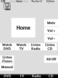 
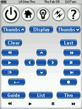
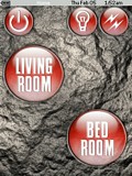
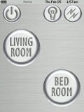
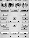
For: Philips Pronto NG By: Steve 'Grog' Burns | Grog's Hard Button Layout Great for a broken touchscreen! Goals for this layout:- Use hard buttons ONLY for control - yes, it can be done! I was gifted a TSU3500 with a busted touchscreen. Layout on screen is a map of the hard button layout.
- High contrast, large buttons on screen for readability. Clear text instead of greyscale bitmaps. Each hard button maps to its one screen button.
- Task oriented, e.g. 'Watch DVD' and 'Listen Radio'
- Universal 'All Off' and 'Home' buttons that work in all screens
- Fast download time to remote / small file size (no fancy bitmaps)
This is the simplest, most functional, least fancy layout I could create. It also works great on my TSU3000 (with a working touchscreen.) |
|
|
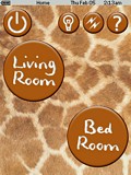 
 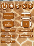
For: Philips ProntoPro NG By: Adam Bursey | Contest Entry #06: Giraffe This layout is an evolution of my TSU3000 layout. It is activity-based and makes heavy use of macros to control my two zones of equipment and home automation. The layout of hard and soft buttons for each device follows a pattern, making it fairly simple to learn to use. It also contains a fairly extensive help system. This look is the result of my wife asking me to do a layout that matched her favorite purse! |
|
|
For: Philips ProntoPro NG By: Adam Bursey | Contest Entry #08: Redrock This layout is an evolution of my TSU3000 layout. It is activity-based and makes heavy use of macros to control my two zones of equipment and home automation. The layout of hard and soft buttons for each device follows a pattern, making it fairly simple to learn to use. There is a help screen for each device. The skin is based on a pattern that matches the paint of our living room. |
|
|
For: Philips ProntoPro NG By: Adam Bursey | Contest Entry #14: White Plastic This layout is an evolution of my TSU3000 layout. It is activity-based and makes heavy use of macros to control my two zones of equipment and home automation. The layout of hard and soft buttons for each device follows a pattern, making it fairly simple to learn to use. It contains a fairly extensive help system. The look borrows from the plastic look of some of the Max OS X widgets. |
|
|
For: Philips ProntoPro NG By: Adam Bursey | Contest Entry #19: Big Sky This layout is an evolution of my TSU3000 layout. It is activity-based and makes heavy use of macros to control my two zones of equipment and home automation. The layout of hard and soft buttons for each device follows a pattern, making it fairly simple to learn to use. It also contains a fairly extensive help system. This look is the result of me playing around with transparent buttons. |
|
|
For: Philips ProntoPro NG By: Adam Bursey | Contest Entry #27: Stoned Aqua This layout is an evolution of my TSU3000 layout. It is activity-based and makes heavy use of macros to control my two zones of equipment and home automation. The layout of hard and soft buttons for each device follows a pattern, making it fairly simple to learn to use. There is a help screen for each device. The skin resulted from a hybrid of Aqua-like plastic button and a rough stone background. |
|
|
For: Philips ProntoPro NG By: Adam Bursey | Contest Entry #31: Quicksilver This layout is an evolution of my TSU3000 layout. It is activity-based and makes heavy use of macros to control my two zones of equipment and home automation. The layout of hard and soft buttons for each device follows a pattern, making it fairly simple to learn to use. There is a help screen for each device. The skin is based a concept of liquid metal. |
|
|
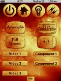
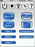
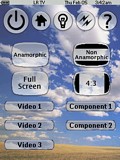
For: Philips Pronto NG By: Adam D. Bursey | Adam Bursey's Custom PCF This is my original TSU3000 PCF. The buttons and backgrounds are based on Apple's brushed metal look. It is fairly task oriented, but retains some of the device-oriented flavor of my TSU1000 CCF. Contains controls for two zones of equipment and whole house home automation. |
|
|
 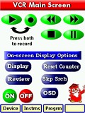
For: Philips ProntoPro NG By: Michael Burwen | Contest Entry #24: Simple Elegance This design was created with specific ergonomic objectives in mind:- Ease-of-vision, particularly by senior citizens. This dictated using relatively large, primary-color icons against a white background. The color scheme was devised by Mr. Gary Hoover, a retired famous movie-industry colorist and graphic artist.
- To provide self-contained instructions. On each page, depressing the owl "professor" icon leads to one or more text instruction pages.
- No more than two screens to operate any single device.
- To use the hard buttons as much as possible.
- K.I.S.S. i.e., pass the "wife" test.
Most of the graphics are original and were created with Paint Shop Pro 8. The instruction screens were created with Photoshop Elements 2.0. |
|
|
For: Philips Pronto NG By: Michael Burwen | Michael Burwen's Custom TSU3000 This is a revision of my previously submitted file. It makes better use of graphic icons for buttons and cleans up some inconsistencies in my previous upload. The principal design objective here was to make the screen as legible as possible given the rather dim nature of the TSU3000. I have been testing various screen icons and layouts on several people and feel that older users find it easier to use this schema than the more elegant 3D designs. Another objective was to make use the hard buttons: the row of buttons under the screen is used exclusively for navigating between screens. |
|
|
More System PCF Files: [ < Back | Next > ]
Return to the Complete System Setup Files index. |