Your Universal Remote Control Center
RemoteCentral.com
The Great ProntoPro NG PCF Design Contest
Up level

Up level
The following page was printed from RemoteCentral.com:

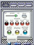
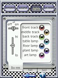
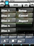
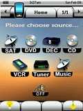
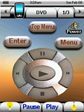
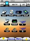
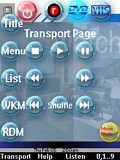
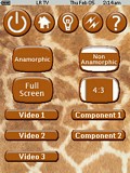
The Great Philips ProntoPro NG PCF Design Contest
You are on contest entries page 1 of 6.
[ Home ] [ Page: |1|2|3|4|5|6 ] [ View Results ]
#1: Perforated Metal

RUNNER UP! I have put a lot of thought into the layout of my PCF design and I think it makes good use of the Pronto NG’s color capabilities without being gratuitously flashy. I wanted to give the design a sense of spatial depth and for it to have an industrial feel, like it was actually made of materials that would be used to construct an RC device, but I also wanted it to have a slightly surreal quality to make it fun to use.

The design incorporates both “activity” and “device” concepts. The “cinema” pages, for example, execute macro events where audio,... (read more)

[ View & Download ]

#2: For Ever Blue

RUNNER UP! This PCF is a modified version of the one I use on my remote. It has continued to change and be enhanced almost every day for two months! Most of the buttons have been redone several times to look right on the actual remote. Things you might miss a first glance are:

  • Buttons that blend into the background (on the side and top bars).
  • Shadows on some buttons and text. On the actual remote the home page buttons actually seem to float above the background.
  • In the “Power Center”, rocker switches that seem to work when pressed.
  • All b... (read more)

    [ View & Download ]
  • #3: Simple Theater

    My approach to developing the user interface for my ProntoPro NG was focused on practicality and function. The PPNG's utility, in my opinion, comes from its many hard buttons--allowing a user to issue commands without looking down at the remote. My design therefore tries to use the hard buttons for the most common operations: arrow navigation, chapter advance, home page, the "TiVo" button, and so on.

    I believe the most practical user interface for an entertainment system is one that focuses on activities rather than devices. The design I've implemented hides the devices that are merely provi... (read more)

    [ View & Download ]

    #4: Clean & Simple

    I have developed a very clean, simple and neat Activity-based configuration, which is also fully functional. It features simple custom graphics and custom-labeled buttons. In addition, it includes my first attempt to develop a transport graphic which was derived from a digital photograph, from one of my OEM remotes. My configuration features 100% .png graphics which all utilize a transparent background, for that custom look. My .pcf features 10 devices on 42 pages. The Yamaha device contains some 30 + discrete codes.

    [ View & Download ]

    #5: Digital Lifestyles

    This remote features for the user:

  • Inviting splash screen introduces the location of the remote, the designer, and features inviting background art.
  • Color-coded functionality, allowing easy discernment between video and audio functions. The user may simply glance at the remote to find where they are.
  • Directions are provided on pages that may need instructions to continue use.
  • Subdued background art demonstrates the selected function without overpowering displayed buttons.
  • Latching source buttons that glow to let the user know exactly where they are.
  • Pages are titled... (read more)

    [ View & Download ]
  • #6: Giraffe

    This layout is an evolution of my TSU3000 layout. It is activity-based and makes heavy use of macros to control my two zones of equipment and home automation. The layout of hard and soft buttons for each device follows a pattern, making it fairly simple to learn to use. It also contains a fairly extensive help system. This look is the result of my wife asking me to do a layout that matched her favorite purse!

    [ View & Download ]

    Continue to more entries on page 2! 

    Hosting Services by ipHouse